Before the first episode of Neverland goes up, I want to talk about another band that I’m very passionate about. They’re a band I saw live almost by accident at KCON NY 2018, and I’ve been effectively in love with since. They’ve got an edgy style, they’re not afraid to push boundaries, they’re talented dancers and singers, and – importantly for me – they write their own music.
I am of course talking about the JYP boy group Stray Kids. I honestly didn’t know them barely at all before I saw them (I was there to see Super Junior) but I quickly grew fond of them. They have a great spirit and are all about positivity – things I generally need in life. K-Pop is hard to love when you know the idol industry can be so taxing. To see a band so full of life – largely because of their own work – makes me really excited to be a fan in general.
Fans that keep up with Stray Kids probably expected my first Stray Kids article to be about “Levanter” since that’s been doing really well at the music shows and is their most recent release. And I do plan on talking about that – however, my heart is set on “Miroh” as of late. And can you blame me? It’s a great pop beat with a good hook, gets your heart racing, has great choreography and never has a dull moment. It’s a great song to jam out to. The lyrics also hit hard – “It’s not hard in this rough jungle” is very indicative of where new K-Pop is heading.
I actually want to talk about the VFX of the video – because that’s what caught my film student eye when I first watched this video. It was surprisingly not too fake looking or ostentatious, but is prevalent throughout the video. There’s also a variety of filters and camera effects that give the feeling of a cohesive time and place, a world that you want to experience more of.
Color is the basis of all film effects, and there is much to be said in way of color for “Miroh”. The entire film is very cool toned, with occasional warm lights to balance it out. Most of the video is blue and red, even the clothes falling along those lines. The backup dancers wear black and the boys begin to adopt black as a clothing color later in the video, along with neon green. However, since so much of the video is in the cooler palette, I’d say the dominant color palette of the video is the cool tones, with light and dark blue being the two dominant colors and red being an accent.
The color pushes the story to us. The story is admittedly a bit vague, but it’s the standard dystopian story with a Stray Kids twist – oppressive force appears, seems to be in control, dancing boys come in and save everybody. This has a number of symbolic meanings, largely pertaining to the idol industry but also to the way kids are treated in any environment where people enjoy ignoring them. Since the message of the song is pushing through adversity, the oppressive force of men in lavish suits is representative of such adversity. This is a theme that’s come up in K-Pop videos as early as Brown Eyed Girls’ “Sixth Sense” in 2011.
Blues invoke generally calm, peaceful, and melancholy emotions in us – so red as an accent stands out as a color indicative of passion. The combination of the two perfectly underscores the themes of the video. Most dystopian K-Pop videos either go the route of green undertones to look more cinematic or white overtones to look more sparse. Stray Kids does neither – they have their own spin on the visuals, which automatically sets their video apart from the norm.
The first instance of VFX we get is around 15 seconds in, and it’s a transition. We go from some security footage to I.N standing in front of the security televisions, but this is done through glitch effects that are centered around I.N himself, so it feels like they are moving with him.
The next (major) effect we get is Felix’s glitches. It starts with him speaking the lyrics to the song while the backup dancers run towards the oppressors. As the beat ramps up, it cuts between different clips of him talking, but saying all the same words, giving the feeling of being choppy. Then, the background turns into pieces of code and stock footage of the city they’re in, all animated to the tempo.
The lighting in this image is slightly different than when Felix started talking. This makes me think they had him doing these lines on set and in a studio with a green screen in the back, and tried to replicate the lighting indoors. So his face has much more intense diffused, probably because the light was closer to his face.
Of course there is the title card that says “Miroh” and the giant lion balloon. The balloon in particular shows up throughout the video as a repeated symbol of power. The thing is, in this video, it doesn’t show up in too many shots, and in those shots, it tends to be one of the only effects there. Digital VFX work best when you rely mostly on practical effects, (trigger warning: gore) and then use digital for certain elements that won’t carry otherwise. Everything that the boys interact with firsthand is a real set piece, so digital VFX like the balloon make the video even more powerful.
In terms of practical effects, there aren’t too many to speak of here, since the video generally relies on the band members and their dancing. But there are a few we can talk about, notably around 2:50 in the video. The setting goes from day to night, and while the backdrop is definitely digitized (very well, I might add) the lights on the band members change, so that it actually looks like a transition to night. This is a very simple and powerful effect that really works to establish a change in time. Building on this, there are also flood lights in the back that toggle in and out during dances, which also separate these scenes from the day sequences where we actually see the oppressors.
There are some other effects throughout the video. Bang Chan’s face and hands are stabilized as he physically moves in a circle, so it feels more like the world around him is spinning. There are also transitions that glitch across or bubble outwards, giving a sense of motion. The thing is if the video didn’t have these transitions, the video would still be great. A good effect means that the video could work without it, and these transitions generally elevate the video, they do not distract from it.
I want to come back to the backgrounds being digital for a brief second. We see the boys on rooftops a lot. These backdrops generally don’t change, beyond moving with the camera angle (the day night shift is an exception.) However, the backdrops are far enough away that we don’t have them in sharp focus, which I think is beneficial to the video. If they were in sharp focus we’d actually be able to see that they weren’t real (just look at any Transformers movie that tries to go into hyperrealism with its effects.) Plus, the dramatic camera shots give a feeling of believably to these images.
The last effect I want to talk about is the noise filter over everything. The entire MV has a noise filter over it, which makes it feel like the movie was shot on film and not digital. This is extremely important to the video as a whole. It flattens all of the effects, and gives us the feeling that everything is part of one environment. The issue with shooting on digital is you have perfect images, and adding effects to the background, while easier, can look fake. Having a noise filter over it makes it grittier and more real.
“Miroh” is a beautiful video. Stray Kids doesn’t cease to disappoint on even the smallest things. The scope of this video is very small but it feels so much bigger – and that’s what you want from a music video, the feeling that something is bigger without forcing it. “Miroh” does this perfectly, in great part because Stray Kids themselves have the skills to carry a video without the extra stuff. The effects just bring out everything good about them. Good filmmaking is best at its most minimal, but when you have special effects and they work, nothing can beat that.
Here is the opening sequence and breakdown for The Neverland Project, my fan project based on BTS’s music videos from “I Need U” through “Spring Day”. As someone who is seeking to educate through my blog, I think I would be doing a disservice if I didn’t give a rundown of techniques used on a project of my own. I will avoid spoilers as much I can for the actual project, but I may leave some hints scattered in – so keep an eye out!
Before I start, I want to say I’m not trying to “solve” the mysteries of these videos, or speculate as to what the originals are about. As far as I’m concerned, BTS made the videos with their ideas, and have even made comics in their universe and such. That is all unrelated to what I’m doing. I am telling my own narrative through this method. I’m using the members and their acting, and the various images, putting my own spin on them. Thus, I’m not really taking anything as “canon” or “not canon”, but creating a work that you, as viewers, can analyze and derive meaning from on your own.
I wanted to create an anime-style opening for Neverland, for a number of reasons. One was probably ego, since I wanted to flaunt my editing skills. But can you blame me? The other was a desire to use a lot of clips that I didn’t think fit in the actual narrative storyline. I particularly wanted to use BTS’s Wings Tour teaser, because I loved the experimental shots and general symbolism. I also have wanted to – even long after I stopped listening to BTS regularly – make a video using “Boy Meets Evil”, because I think it’s a song that climbs so beautifully. It ramps up tension extremely well. So, I figured, why not make an opening sequence? I’m doing an episodic structure anyway.
The theme went through a number of iterations, because I couldn’t settle on the order of images and the colors. I also had way too much going on in way of commissions, schoolwork, and another project I’ve been working on that’s completely unrelated to K-Pop. So I figured that a teaser video could expand upon my concept while I work on finishing the rest of it. The work itself is half done, with the first episode needing a bit of fine tuning before its release.
So now that we have a bit of context for the production of this piece, let’s get into it!
The opening shot is from BTS’s “Spring Day” – it is a train entering a tunnel. Tonally speaking, I think this is the perfect shot for Neverland. I feel like the themes I play off of from BTS’s work include anxiety taking away the figurative light from the lives of young people. So, since both come up frequently in the work, and both are in this image, this is the perfect opener.
Then, I have V climbing up the tower. (Prologue) This will be a scene in a later episode. Notice that this is all in black and white – color is a motif I use frequently in all of my work. It communicates emotion and personality well. But the absence thereof also says something.
We see V look at the camera. (Wings) Things become color for a split second, before we move into Namjoon walking through the train. (Spring Day) When he opens the train back door, it’s the Omelas motel.
Interspersed with this is Jin staring up the stairwell. (Spring Day) He’s in full color, the rest is in black and white. As he pulls his hands up to frame the screen, the world becomes color, and when he puts them down, he himself becomes black and white. Once again, this is my way of playing with color to indicate certain plot points or themes.
This next sequence revolves entirely around V. It cuts between two shots – the first is V growing wings. (Wings) The second is him standing on top of the tower from earlier. (Prologue) Below the wing shots, I’ve added color images from “Stigma”, which show a confrontation with cops. This will come into play early in the story, so log these images. Also log the absinthe imagery (Blood Sweat and Tears) and Namjoon standing in the train. (Spring Day)
The incidental sequences with J-Hope, Jungkook, and Jimin are all crucially important to the story. I won’t say how, but note that J-Hope is in full psychedelic color, while Jimin and Jungkook are in gray with elements of color around them.
Another grayscale scene – just Jin watching his friends through the camera. (Prologue) It cuts to a full-color shot of fireworks. (Reflection) Things become very montage-heavy after this. I heavily edited and layered many of these images, but note that the elements of color start to get bolder and more experimental – and we amp up to full color as the music progresses. I did this to increase tension, since viewers will acclimate to one way the motif is being used, and this acts as a change of pace.
Note the rest of the images used throughout the opening. J-Hope is pulling at the walls in a padded room. (Mama) V falls on the ground, beaten by an unseen force. (Stigma) All of the boys have a pillow fight. (Run) Distorted retro images of Jin and other experimental elements flicker across the screen. (Epilogue) Jimin submerges his head in water. (I Need U) Jungkook runs towards the motel. (Spring Day) Suga is surrounded by fire. (Epilogue) Jin’s face cracks open as if he’s made of glass. (Wings)
All of these images will become important scenes later on. I don’t mean that each one will be game changing, pivotal etc. But, these images will have much more clarity in the future.
In the final moments of the opening, I have BTS walking through a field. (Spring Day) Yes this image has appeared already, and I probably will use this image at some point in the Neverland episodes. But I also added V smiling at the camera, with his wings wide, and Jin’s face cracking again. (Wings)
I should note that V is not a malevolent figure in this story, but as you will come to see, his actions do affect the story significantly. So, who is the protagonist? Is it him? Jin? Or one of the other members?
This concludes the breakdown of my edits for the Neverland opening. I welcome any constructive criticism – anything can help me to improve my work. I started this project because it posed a challenge – creating a story from a bunch of connected films that take on wildly different filmmaking styles is no small task. It’s even more difficult to communicate a feeling through these constantly shifting pieces. So this has been an adventure for me. There will be more episodes coming soon, starting January 1st and generally releasing every few weeks.
This is a long time coming. I’ve been promising this article for a while, as a part of my Cinnamon Bubblegum series. But, with recent developments in the K-Pop industry, I think it’s pertinent that I talk about this video now.
Of course, I’m referring to the deaths of Sulli from f(x) and Goo Hara from KARA. A lot of people are saying that this is casting a light on the pressure K-Pop idols undergo. However, I think that the pressure of idols is common knowledge. The concern for me is how often K-Pop fans are willing to ignore these pressures, in order to be consumers. I think personally, that it is possible to be a healthy consumer of K-Pop. So, that is what I am going to do. I am going to use Twice’s “Likey” to explain to you how to be a healthy consumer of K-Pop.
UNDERSTANDING LIKEY
While “Likey” a solid pop song and extremely catchy, the heart of it is in the lyrics. The song is about social media and how it becomes difficult to draw a line at the high you get from likes online, and how you take care of yourself and your mental health.
For instance, take these lyrics:
BB크림 파파파 립스틱을 맘맘마 카메라에 담아볼까 예쁘게
Put on BB cream, pat pat pat Put on lipstick, mam mam ma Shall I make a pretty pose for the camera?
For those of you who don’t know, BB Cream is a type of makeup. It’s a combination of moisturizer and foundation. It’s extremely prevalent in Korea and other Asian countries, but is also common in American makeup.
Basically, the song talks at length about how getting dolled up to look pretty is difficult, but we do it anyway for the sake of our internet audiences. It’s very similar to the point made in the video for Sunmi’s “Noir”, though “Likey” is far more subtle about getting the point to come across.
The thing about “Likey” and Twice’s other music videos is that they don’t necessarily show the point of the video overtly. A lot of the messaging, while powerful, is toned down and made subtle. This is both a good and bad thing. On the one hand, I want to see more overt conversation happening, but at the same time, the subtlety is key to its success. You won’t notice the message the first time around, but you’ll notice it the second time. It means that the more you watch it, the more you’ll be able to get out of it.
This is absolutely a valid approach to filmmaking of any kind. For example, take Train to Busan, the 2016 Korean zombie movie. It’s a movie about zombies, sure, but there is a prevailing amount of class imagery. The main character himself is a successful businessman, accused by characters of being a “leech” – even his own daughter says this about him. Every person who he or his daughter take the time to help, however, ends up helping them in the long term. An old woman, a homeless man, a middle class man and his pregnant wife, some high school students – all are disenfranchised in some capacity by Korean societal classism and attitudes on age and gender. In the end, it’s the people on the train who submit to these ideals on their culture that become the horror of the film, not the zombies.
Comparing a Twice video to a zombie movie is probably a strange comparison, but Korean films and music videos make use of subtlety beautifully. “Likey” is no different. In the video, you see Twice performing everyday tasks, but recording them on handheld cameras. The visuals are even “filtered” at times, which takes the girls from moderately made up and undersaturated to an oversaturated world where they’re in different outfits and playing around. Hearts appear throughout, much like an Instagram post. The album is even named “Twicetagram”.
This is a good way of communicating the ideas of the video because if you like the song and peppy visuals on the surface, you will be more interested in what’s happening underneath. Once again, this is like Train to Busan. If you like zombie movies or thrillers, you will probably enjoy this movie, and if you watch it again – because it’s Train to Busan and you love it – you will see all of the subtle hints at the real message. It’s brilliantly done for this reason. Twice’s videos all tap into this same propensity for subtlety, and because of that, they’re brilliant.
STEPS TO BEING A HEALTHY CONSUMER OF KPOP
For this next part, I’m going to be pulling elements from this video, and presenting different steps for being a good K-Pop stan.
1) LIKE, BUT REALLY, COMMENT
I already mentioned the proliferation of cameras in the video, as well as filters and social media imagery. But one moment stands out to me. The moment where Momo is sitting in a chair while everyone does her hair and smiles around her. She looks visibly uneasy. She doesn’t want to sit in this seat, but she does. This is also the part with the “BB Cream pat pat pat” lyric. She’s posing for a camera but doesn’t want to be there.
There’s a lot of hate towards K-Pop idols on the internet. Some of it is from anti-fans who hate K-Pop in general, sometimes it’s fans trying to start fan wars. Sulli from f(x) was an advocate against this behavior and ultimately, the hate against her likely contributed to her death.
We don’t really think about how the idols feel about this, and it makes sense why. Trainees often have their internet access restricted, so they don’t see the things people say about them online until a great number of people already swing one way or another. Then, they tend to refine their online appearance, the same way normal people do. They tend not to get involved in fan wars because they don’t want to antagonize people. It’s a lose-lose situation, unfortunately. If they respond, they get hate from the people hating on them. If they don’t, then they run the risk of seeming detached, and people turn against them.
So, what can we do? Well, the support on social media helps. But likes only get you so far. It’s a very superficial way of telling someone you appreciate them. Especially on Instagram, where many idols congregate – there is no dislike button or anything, so your only choices are liking or commenting to tell a singer how you feel about them. As a result, there’s a number of people in the comments that do nothing but hate on these people. The things that will catch each idol’s eye more are the comments, since that’s where people are saying how they feel, and if there is too much hate in those comments, they will start to believe the hatred.
Instead of liking a post, comment on it. Words are a far less superficial form of validation and while there is a parasocial nature to any interaction with a celebrity, the fact of the matter is it’s a good way to show that you care. It might take a little longer, and a little more effort, but when they see how much love they’re getting in place of the hate, it does something positive. It shows them that they do matter to us, collectively.
2) SPEND RESPONSIBLY
There’s a lot of consumerism in this video. Jeongyeon ogles clothes she sees in a store window, store sign imagery is rampant – even the outfits push an air of consumerism. They often look too polished for the environments these girls are in. It feels off-putting, overtly glamorous, likely on purpose.
K-Pop is ultimately an industry, which makes money off of digital sales, concert tickets, and merchandise. I’m not knocking it for that – I’m in the film industry, which makes its money off of production, movie tickets, and merchandise. I do not claim superiority over the idol industry in any way. But what film production has taught me is that I should be careful about which creators and filmmakers I should support.
I strongly dislike Stanley Kubrick’s films in great part because he as a filmmaker was a terrible person. It took me forever to watch The Shining, and when I did, it left a sour taste in my mouth anyway because I knew he was abusive to the lead female actor. The one Kubrick movie I do like, Full Metal Jacket, still leaves a sour taste because he would shoot a single shot thirty times. In his mind, the first twenty-nine times, it wasn’t perfect, but he wouldn’t give any criticism to his actors to improve it.
In my book, a director who manipulates everything to the point of being his definition of perfection to the point of mistreating his actors is not a director, but a dictator. That said, despite my misgivings, I have to acknowledge the contributions he made to filmmaking. I won’t sit on my high horse about it and negate such contributions. But I’d rather watch something like Baby Driver than sit through A Clockwork Orange.
Apply the same principle to K-Pop. Some record companies are known for mistreating their singers; some are less severe. Some idols are cruel or arrogant; some are not. I don’t believe in cancel culture, but what I do believe is thinking about why you’re spending money on something. Merch is fun and all, but I don’t know if I necessarily would’ve bought any of SeungRi’s music if I knew Burning Sun would happen.
I absolutely am willing to spend money on Twice because I think their message is incredibly positive. Songs like “Feel Special” are incredibly important in an industry that has long since relied on songs that don’t have as much dimension, and are meant to make you feel good on the surface. I feel the same about Twice as I do about ITZY and Stray Kids. So, I’ve gladly bought their music.
If you truly admire your favorite bands, no matter what record company they are from, then you should absolutely spend money on them if you want. Support the idols you most believe in, but also hold them accountable. If something doesn’t sit right with you, focus your attention somewhere more positive. Because fueling a fire of negativity won’t do any good.
3) PERSPECTIVE
It intrigues me that “Likey” depicts these K-Pop idols doing normal activities – getting ice cream, dancing in a school gym, and riding a skateboard. These singers would likely get mobbed in public if they did any of these things. But that’s the point of the video. These girls are human beings. They eat ice cream, they go to school, they do all sorts of activities we do.
There’s a lot of discussion online about whether or not K-Pop fans support an industry that is exploitative of “woke” culture when it historically treats women and minorities badly. I personally think the debate lacks perspective on both sides. On the one hand, some K-Pop fans would like to assume everything is okay and that there are no issues. On the other hand, shamelessly bashing the industry is not going to get us anywhere. Many people exist in the middle of this debate, thinking that yes the industry needs to be fixed, but that doesn’t mean we should stop listening to it. However, many of those fans tend to be quiet during these debates on the internet.
I personally exist somewhere in the middle, but I think my opinion can best be expressed this way: “Idols are people too.” To take any establishment, be it a company or industry, and say that it’s all bad because of the policies or people in power – that removes any level of nuance from the debate. More harmfully, this takes empathy away from the people directly affected – in this case, the idols. When we rope the entire industry together and say that it’s all terrible and we should steer clear of it however we can, we forget that there are people caught in this system.
Imagine that every act you did was suddenly televised. What would it do to your psyche? We all think we want success, but when we get it, we always wish we could go back. But that doesn’t make you any less of a person. I think the issue with the current debate over K-Pop is we assume that the K-Pop idols are a part of the industry and that’s where their own agency and thoughts end. Much of the debate is “The industry is bad, therefore all idols are fake,” and “My favorite idols aren’t fake, therefore the industry isn’t bad.” The issue is not black and white.
What we need to do, collectively, as fans, is this: we need to remember these idols are human beings before anything else. The industry can be cruel but we can’t forget that there are humans caught in it. We can hate on bands or companies until we’re blue in the face, but in doing so, we forget to have perspective. We can’t allow ourselves to do that.
TAKEAWAYS
The industry is rapidly changing, always, every day. New bands keep appearing, new record companies, new songs. Every time I go to bookstores in Koreatown, I see a new album for a younger group that I haven’t even listened to once. But the principles I’ve addressed here will likely not change. The fact that social media affects the psyche, the fact that we should spend on the singers we truly believe in, and the fact that these are people with real feelings we should be empathetic towards – these are all important things we need to keep in mind in the future.
Jonghyun, Sulli, and Hara were not the first. They will probably not be the last. But it’s on us to prevent what happened to them from happening again. Where you put your likes, your comments, your money, and your love – it matters, in the end. Your voice matters as much as their music.
It’s been a while since I last talked about Sunmi and since then, there have been a number of releases from her, which gives me a lot to talk about. So, when doing some research on her new releases, I decided to take a listen to “Noir”. And, let’s be honest I was blown away.
“Noir” is a strangely serene, eerie alternative-pop song. It’s very repetitive in its underlying tracks and chorus, but for some reason it still feels new every time I listen to it. The song transports you to another world, a bubble that colors your whole world around you. It’s not a bubble of safety but a bubble of perspective. The music video itself is all about perceptions and changing how you act to appeal to a mass audience.
Honestly, this is something I personally grapple with as an artist and as a child of the internet. Do I tell people about all of the hard things I go through? Do I put on a smiling face? Or do I do what some people do and capitalize my troubles? “Noir” is a beautiful video that explores this issue in a number of creative ways, all with bright colors and crisp visuals. While the video does go in some scary, downright frightening directions, it never ceases to be visually pleasing – which shows the exact issue that the music video is struggling with.
The aspect ratio of the video is 1.375:1 approximately – the video is generally letterboxed on the sides. This narrows our perspective and gives us a retro feeling. 1.375:1 is in fact the Academy of Motion Picture Arts and Sciences standard. It’s an interesting choice because the standard aspect ratio of YouTube and most music videos is 16:9. So even though the music video is intended to talk about the internet and modern day, it’s shot to give the feeling of traditional filmmaking – the kind you’d send to be developed off site and not know how it looks until you are in the cutting room.
The colors of the video are generally pastels, but there are some bold colors that stick out – red, fuchsia, blue, turquoise, orange. There is minimal use of black, but it stands out whenever it appears – usually on one of Sunmi’s outfits, or in the shadows. But what makes the film so dynamic is the texture. In fact the first shot we get is pure texture – Sunmi’s barely-chapped, gloss covered lips. Her hair and her clothing also provide texture, not to mention cloth backgrounds, furniture and of course, fire.
The symbolism hits particularly hard, specifically with regards to how actual filmmaking works. I will deliberately choose to not be patronizing and explain the purpose of the cell phones, selfie sticks, use of “like” and “dislike”, etc. because those are so prevalent in modern culture. But what makes Sunmi’s “Noir” work is the subtle symbolism. The reference to the ALS Ice Bucket Challenge, the knife game, the reference to “Gashina” – none of this is explicitly spelled out for the viewer, but due to our collective internet culture, we feel the weight of those visuals. They mean something to us.
However, what impacts me the most is the way framing of the shots, both on a broad and small scale, impacts the symbolism as a whole. Framing a shot can make or break your whole movie. The effectiveness of the way “Noir” is framed can be shown in four specific scenes: the flowers scene, the wine/death scene, and the makeup-gone-awry scene. The first two heavily rely on the phone as a tool for framing, but the makeup one does not – and we’ll dive into why.
The flowers scene is comprised of two specific shots. The first has Sunmi singing next to some flowers, in what looks like a rose garden. It’s edited to look like an instagram post of Sunmi’s. But in the next shot, we get a wide of where she actually is – a bathroom, with some strategically placed flower pots on a shelf next to her. She’s perfectly centered in this wide shot, sitting on a toilet in some glamorous, designer outfit, with her hair filled with butterflied as she sneezes into some toilet paper. The shot is continuous, slowly dollying into her face. In two shots, we have a whole story.
The death scene is composed of three shots, though two are nearly identical. It’s effectively the inverse of the other one, in that we start wide, then see the phone perspective. It’s pointed downwards on what seems like a tripod, but because the floor is at an angle everything feels weirdly slanted. Sunmi dominates one third of the screen. A wine bottle pours straight downwards, while a wine glass sits on the far left perfectly normal. The shadows are intensely dramatic, making Sunmi look extremely ominious. The next shot is a close up of her on the ground, next to the spilled wine, which looks suspiciously like blood. She sits up unharmed as the camera pulls away and we see her full body – but the next shot, through her phone, is an image of her on an Instagram Live, looking fairly dead next to that wine. People in the comments are worrying about her. Framing is everything.
Without the phone being used as a viewpoint, the makeup scene is particularly haunting. We get the mirror shot in the bathroom, with the main viewpoint being Sunmi’s lips as she puts red lipstick on in a pastel green room. We punch closer – the lipstick is now being spread across Sunmi’s face. The next shot of her we get, her hair is teased up, her eyeshadow is smeared, her lipstick looks kinda like the joker’s smile. Finally, we get a wide of the bathroom we saw earlier, however at an angle. She’s smack in the center, barely illuminated while her shadows fall across the wall. The intense angles of the shadows in this scene show just how broken she’s become by the time we get here – and yet she’s still taking photos for the world to see.
Sunmi’s “Noir” is a beautiful way of showing just how complicated our world has become with social media. It takes an anti-social media stance, however, I don’t think it’s completely against it. I think it would be more accurate to say this is against using social media to make a false version of yourself. As with any medium – film, literature, art – your phone can be used for good and evil. Film has been used for propaganda, literature has been used to control people, art has been used in politics. We now have the ability to cause world change with our fingertips with our phones, and yet we spend our time on social media creating false versions of ourselves. We have a powerful and dangerous tool at our disposal now. Sunmi is hyper-aware of that, and the power that comes with being an idol.
With the death of Choi Jinri, better known as Sulli of f(x), hitting headlines yesterday, we have to call into question how we treat other people online and how we depict ourselves. Sulli was actively against cyberbullying, having been the target of much of it. We have to call into question the role that K-Pop fans and anti-fans played in her life, and how we can learn from what we collectively did right and wrong. We also have to call into question the pressure idols feel to always have a good time on camera and never show their struggles – or if they do, to monetize their struggles. “Noir” is incredibly important in showing us the pain of an idol’s experience, as well as the experience of the individual. It’s not that we should collectively harness the power of social media to “do good”, but rather be aware of the power we have, and how it can positively and negatively affect our lives.
This is Part 2 of a multi-part series. Please check out part 1 [here.]
Fashion is one of the most effective tools in all of filmmaking – in fact, one of the most effective tools for communication in general. Fashion tells a person your personality, your background, and your artistry. Fashion can be used to create a character. It can be used to make a good impression. It can even be used in diplomatic relations, to communicate an idea. Fashion is one of the most useful things in the world, because it ultimately is a form of communication. In film, there are a lot of variables that change what the costume designer will choose. While that may seem like something that everyone would agree with, the decisions behind costumes are not intuitive ones. One swatch of material can alter the entire film.
What makes K-Pop so fascinating is how fashion is used to communicate a group aesthetic. Girls wear matching skirts and heels, while boys wear baggy pants and oversized shirts. Of course, there are a number of reasons K-Pop group fashion is the way it is. Everything has to give enough freedom of movement for the idol to dance. There needs to be cohesion so that no one looks out of place. And each member still needs to look individualized enough to be identifiable so that you can pick a clear favorite.
In addition to these principles of K-Pop fashion, there are also elements directly affected by the music video or song. The genre of the music video dictates whether you dress in an edgy or cutesy or creepy way. If the music video takes place in a different time period than the present, all the outfits have to be period as well. If there is a story arc, then the outfits must reflect the individual characters – what their interests are, what their past is, what their eventual fate might be. If anything feels askew to the audience then the spirit of the video is lost.
ITZY has only had two major music videos as of the writing this article, but their awareness for fashion is incredibly acute. While everything is eye-popping and beautiful, there is a level of harshness that makes it all the more wonderful to watch. I don’t mean harshness in that their fashion is bad – I mean that in the sense that it goes against the grain of what most K-Pop girl groups are doing, and therefore shatters expectations. It doesn’t capitalize on its weirdness, but it capitalizes on its difference. What makes it harsh is how it is used and what it communicates.
In this exploration, we’re going to cover “Dalla Dalla” and “Icy” at the same time, and we are not going to split it up by members. Instead, we’re going to cover four themes: cohesion, branding, makeup, and message. There will also references to other bands or works of art. None of this is meant to insinuate that ITZY is stealing their fashion from anybody – rather, it’s to provide a frame of reference so as to clearly illustrate the impact these girls have. The only way to make art is to learn from the artists that came before you.
Cohesion (or lack thereof)
As stated before, there is this tendency for K-Pop bands to have extremely coordinated outfits. Bands like AOA are good examples of this, where everyone wears the same outfit. I find this extremely frustrating in videos, unless it’s a video like gugudan’s “Chococo” where the plot kind of relies on everyone being dressed the way. It just feels a little lazy to me. K-Pop relies heavily on people being able to choose their favorite member, so when everyone is dressed the same my first question is “but why?”
A lot of boy bands manage to get away by the seat of their pants by having everyone dressed in the same style. BTS, SHINee, and EXO all do this – and they are not the only ones. So many sport coats or various forms of jacket, tight pants that are weirdly wide at the crotch (so as to maximize dance movement) and minimal difference between outfits. This isn’t always a bad thing, but it always tends to be the same kinds of outfits that get this treatment. It’s usually done to create a sense of unity between members so that they all look like they’re part of a group. The thing is, some bands take the same basic outfit and manage to do a fantastic job of differentiating members with subtle features as opposed to just “here have a scarf” (see my articles on EXID’s “L.I.E” and Dreamcatcher’s “PIRI”).
On the opposite end of the spectrum, there are times when bands just don’t care about cohesion at all and do whatever they want. Again, this is usually a guy group – BIGBANG and BTS specifically. I plan on doing an article on BIGBANG’s “Fantastic Baby” sometime soon (Burning Sun ruined them for me as I’m sure it did for many people, so I’ve been apprehensive about writing one) but one of the things that has always stood out to me is how different everyone looks. No one is wearing a matching outfit until the final moments of the video. Then of course we have BTS’s “Dope” which relies almost entirely on everyone wearing outfits for different professions. Girl bands also do this, but usually when they’re isolated, not in fully choreographed parts of videos. Boy bands have less restrictions in this respect.
ITZY leans into individuality more than cohesion which is incredibly refreshing. This largely has to do with the fact that the band relies on its message rather than typical K-Pop group creation. Their fashion largely reflects their “I don’t care” disposition and as a result, they aren’t relying on looking like each other.
Take for instance, “Dalla Dalla”. Their are two elements that tie all the outfits in together – the color black and the occasional splash of glitter. At one point they all wear fur but it’s only for a brief moment. But their styles are wildly varied. Their accent colors are also widely varied. Their jewelry and hairstyles are varied. They also don’t have an overabundance of pencil skirts – I mean pants are more comfortable for dancing. And walking. And everything else.
In “Icy”, they almost completely do away with coordinating styles except for white accents on some of the outfits and some branding in one choreography section. The styles are even more varied than before, akin to something like a BIGBANG video. This does have to do in part with the plot, but not very much. The plot of “Icy” is girls not caring what other people think of them, so they get placed in a number of situations where they are clearly outsiders. So they are simply meant to look “different”. I actually think that this is fairly effective here, more so than it would be in “Dalla Dalla” where there is not much plot. What we get in “Icy” is a fully realized version of that idea.
Screenshot from “Dalla Dalla”Screenshot from “Dalla Dalla”Screenshot from “Icy”
Branding
Branding in fashion has been an interesting component. It’s been a major part of fashion since the 1960s that has phased in and out of style over time. It used mainly to flaunt a brand, and was adopted tenfold by the black community in the late 20th century to the point where brands such as Chanel began to copy black designers and their use of logos. Our current century of fashion doesn’t really advocate for “branding”. If anything I’d say the retro album t-shirt has replaced the designer logo among millennials and Gen Z. Furthermore, modern fashion emphasizes people combining different pieces however they decide so as to turn it into a form of expression. You may notice certain groups claim different fashion trends – but very specific ones, so as to let you combine whatever you like and express yourself, how you choose. (For anyone who is interested, I recommend watching the CNN docuseries “American Style” to learn more.)
Brands in K-Pop, however, have generally been sparse until recently. Logos and designs have been common, but in a genre that generally relies on the coordination of its idols, it can be distracting for everyone to have a logo. As a result, virtually nobody has a logo on their jacket – unless it’s a hip hop style boy band which, again, pulls influence from African-American fashion.
ITZY, however, leans into the branding completely. Precisely 38 seconds into their first video, “Dalla Dalla”, we get a glimpse at a brand name. Again at 1:06, and again at 1:10 (this time more than one, as all five members are there). They’re peppered throughout the rest of the video. It’s usually a belt buckle, or something on the shirt. “Icy” goes all out – when we first see all five girls together, four of them have logos on their shirts – largely because they’re wearing athletic wear, something that has an abundance of logos. In one of the other dance sequences, the band has matching outfits, all from the same brand, with matching logos. But, it’s all very different pieces from this brand (Iceberg, in case you’re wondering.)
“Icy” is branded content but not in the way most people would understand it. There is a lot of promotion of different fashion labels – Versace, Iceberg, Chanel, Sportmax, DSquared, and many others – the promotion is centered around the members themselves and the labels do not get explicitly mentioned. The pieces are used to build the personalities of the members, not distract from them. Furthermore, these are all luxury brands, and I find it unlikely that most fans would have the means to buy them. Not implausible, but not likely, since most younger fans are probably going to be dependent on their parents and parents are not typically willing to spend that much. I find it much more likely that they’re used to depict ITZY as a band that’s indulgent and takes care of themselves, which is at the core of their message. Obviously, it’s unlikely that the members chose these outfits themselves since JYP probably has an army of stylists. But ITZY appears to be a brand promoting self-indulgence, self-care, and a general “Screw the rules” attitude.
In essence, they’re the embodiment of the “Treat Yo Self” principle.
Makeup
When I was ten years old, I went to a birthday party. A bunch of my female classmates were there already, and they were being treated to manicures and makeovers. All of the girls went straight to picking their favorite colors for eyeshadow – glittery greens and blues that looked extremely gaudy. I ended up surprising the makeup artist when my fourth grade self asked for brown. I had been reading fashion magazines, and I had light olive skin, I knew that warmer colors looked good on me and my brown eyes would look even bigger if I had brown eyeshadow on. I was super proud of my choice, and the makeup artist seemed to like it too. I remember getting a bunch of blank stares from all my classmates, but in the end it didn’t matter. I looked damn good, and went home feeling like I made a good fashion choice.
I don’t wear a lot of makeup now, but I always take great pride in it. I love experimenting with tons of different colors, brands, etc. One of the reasons I love cosplay is because makeup is such a beautiful and powerful component to it. I used to spend a lot of time filming videos for theater in my high school, and my favorite thing to film was always the makeup room, because you could see a person transform into someone else.
Makeup is always interesting in K-Pop because it’s used by everyone. Men use it. Women use it. It can be over the top and it can be bareface, which means that you don’t want people to think you’re wearing anything, but secretly you are. It’s extremely transformative, but it affects how you see the idol. From G-Dragon’s glitter covered face in Bang Bang Bang, to his lip art in Fantastic Baby, to his sunken eyes in Coup D’Etat…basically, everything G-Dragon has done to his face is worth an article.
The point is, makeup is a transformative tool that no one should ever take for granted. So it’s interesting to me how so many female groups are minimalist in their makeup choices. They actively avoid overwhelming you, the audience. ITZY is no different in this respect, but I think it’s done for a different reason. Most girl groups go for bareface makeup with small bits of color. This is largely done to emphasize innocence. But ITZY is actively against that textbook innocent message. So what does the minimalist makeup do?
It’s actually pretty simple.
It makes them look good.
ITZY’s entire core is about making you feel good about yourself. Live vicariously through them and learn their lesson of not giving a f*** about what other people think about them. So when they wear makeup, they’re not doing it to be eye catching. They’re doing it to look good. Take, for instance, “Dalla Dalla”. Most of the eye shadow is smokey brown or black, but it’s not overt. It does just enough to highlight their eyes. Their lips are generally neutral tones, warmer glosses or nude lipstick, neither of which makes them look artificially pretty. There’s a little bit of shine/strobing but it’s actually very tastefully done.
Screenshot from “Dalla Dalla”
It gives you a reason to pay attention to their face. Similarly, there is minimal hair dye in this – their hair is dark, either brown or black, which makes it look much more natural. The styles are varied, and there are colored accents, but it keeps them from feeling doctored.
The concept changes somewhat in “Icy”, but it still makes them look natural. The whole theme of “Icy” is inserting girls in situations that don’t match their personality types, so the makeup reflects that. As such, Ryujin has a cat eye going, because she is surrounded by prudes at her job interview. Lia has deep red lipstick because she’s wearing a formal outfit in a restaurant that is not. Yeji has glitter under her eyes, but her outfit is ostentatious and she’s in a grocery store, so it absolutely works. I’d also like to point out her aesthetic is incredibly similar to that of Jolyne from the Japanese manga Jojo’s Bizarre Adventure – a character who exudes “I don’t give a crap what you think of me.”
Jolyne from Jojo’s Bizarre Adventure (source: Pintrest)
Jolyne from Jojo’s Bizarre Adventure (source: Pintrest)
Yuna has similar makeup to what she had in “Dalla Dalla”, but it’s actually much less overt – not smokey, a little more pink. Chaeryeong is wearing pretty much the same kind of makeup as in “Dalla Dalla” but like Yuna, not as overt. This largely has to do with the fact that she’s just casually on the street, looking cool and doing street performance – which is considered a natural, genuine form of art.
But the fact of the matter is the makeup never distracts from the members themselves. Because they make it work. They look great, it’s not done to make all the members look the same or be part of some major theme. It’s instead emphasizes their core message. I will say that the hair is a bit distracting, but what’s a summer K-Pop release without bleaching your hair.
ITZY’s makeup is all about making the members seem individual. They are a band, but they have lives, independent hobbies, and so on. JYP wants you to be aware of that. So, when it comes to the most beautiful expressive and beautiful of the human body, the face, they want you to see the members as beautiful on their own terms.
Message
As evident by everything I’ve said so far, Itzy’s image revolves heavily on them seeming organic and unabridged. Nothing is done specifically to shock you as the viewer, nor is anything done to make them seem copy-pasted. Each member is unique. This is not just evident in their songs and videos, but in their fashion as well.
What this ultimately tells the fans who are watching is that it’s okay to be yourself. These idols are young adults in the modern age, where young people are struggling to find a balance between image and authenticity, being present online and being present in the real world. This is a loaded thought when it comes to K-Pop, an industry that is extremely manufactured – however, something about ITZY’s combination of fashion, music, and video work makes them feel more alive than many idol groups do.
ITZY wants its viewers – particularly its young female viewers – to feel heard. Having this seemingly random combination of logos, a relatively minimalist style of makeup, and a lack of cohesion between members makes them feel all the more like a unit. But it also makes us feel like we can relate to them. JYP Entertainment, as I’ve said before, has always been good about finding a hole in the market and filling it. When BTS went into a more pop direction, the hole they left behind for edgy social commentary got filled by Stray Kids. As Red Velvet has teetered the line between vibrant colors and vaguely disturbing imagery (“Peekaboo”), we got Twice, a band that uses its cheerfulness as a way to subvert expectations. And now we have ITZY, which fits both markets, but simultaneously represents the group that fits in neither.
So if you fit in ITZY’s demographic – even if you don’t – take some lessons from the way they dress. No I don’t mean dress in Versace all the time. But dress to make yourself feel good, and confident. If that means wearing overalls and sparkly makeup in the middle of a bustling city, go for it. If you don’t want to wear much makeup and dress in all black, do it. If you like dressing like a character from a manga, I am in full support. But the point is that you need to dress the way that makes you feel good, the way that makes you stand out. It’s not that wearing brands will make you stand out – your confidence will do that for you. So when you wake up tomorrow, make sure you feel good about yourself.
This is the first in a series of articles covering JYP’s newest girl group ITZY.
I tend to jump all over the place with the K-Pop bands I listen to, whether they’re male or female, pop or rap, OG or 4th generation. As of late though, it’s been hard to keep up with all the new groups. There are so many, from many companies, all of varying degrees of quality, as well as an over-saturation of the long-standing top bands, such as BTS.
As a result, I didn’t get around to listening to ITZY until a few weeks ago, but I have to say, I was pleasantly surprised by how high quality they were. I’ve heard them referred to as JYP Entertainment’s version of Blackpink, but I honestly don’t think that’s doing them justice. I think that they’re a response to Blackpink, or at least the type of band Blackpink is. At the same time, I think they’re a response to Twice, JYP’s biggest group. It combines elements of both, and yet it’s neither.
There are three camps of girl groups right now. There are the extremely girly bands, like Saturday, Momoland, and Twice. Then there are bands that take a more “mature” approach, like Blackpink or EXID. There are benefits to either approach, often revolving around what age group the fan base consists of. Then there are bands that try to be antithetical to both of these. Dreamcatcher would be the best example of that: it’s a band meant to be totally unique in a genre where it’s very easy to fall into a trap.
ITZY is, in my opinion, in the third camp because of how it incorporates elements of the first two, but the band has other unique qualities that make it stand out. First off, their title tracks have been hooky and electronic, but also relatively upbeat without crossing into the territory of being too procedural.
Secondly, they have sharp dance moves that require full body like GFRIEND, as opposed to a band like AOA where their choreography is mostly small movements. But it’s the sharpness that makes them stand out – it’s something guy groups tend to embody more than girl groups.
Thirdly, their songs have a message of loving yourself, but not watered down like BTS’s new catchphrase “Love Yourself” is. It’s much more about people viewing you negatively for the way you are and not caring, as opposed to the simple act of loving yourself because you’re special – in short, it’s not a superficial self-love, it’s anger and vehemence at a system that tries to pigeonhole you. (Ironically, this message was most prevalent in BTS’s early content, particularly “N.O” and Rap Monster’s single “Do You”.)
Lastly, they have an intriguing use of fashion and branding in their videos. It’s very much meant to enhance the members as opposed to rope them into a concept.
If we look at these qualities, it becomes clear: ITZY is a girl group handled exactly the same way a boy group is. They’re a band with good songs, sharp dance moves, and clothing that enhances their personality as opposed to distracts, who’s also allowed to be angry. These are all qualities you’d see in a big name guy group like BIGBANG or SHINee. I mentioned in my article on Twice’s “Like OOH-AHH” that Twice is given guy group-style songs that have more punch, and called them a cinnamon bubblegum band. If Twice is cinnamon, then ITZY is a ghost pepper. They don’t hit – they bite.
I think that this makes them antithetical to many other girl groups because it’s in direct opposition to the way most girl groups are conceived. JYP has always been good about finding an opening in the market and making a band that exactly embodies this. I think that Itzy is the closest thing we have to a representation of what a modern late teenage, early twenties aged girl is like. They have more depth than that, as well as charm. They’re not a stereotype in any particular way, they just kind of exist. None of them are typecast into particular roles.
This movement away from typecasting probably started around 2010, as people generally speaking prefer chemistry between idols. I talked about this a bit in my Super Junior article, but the status quo of creating a group still held until at least 2010, perhaps even later. That status quo: you need a cute member, a mature member, a funny member, a cool member, and a stereotypical maknae. I would not say that ITZY has that – ITZY does have a member that’s more extraverted than the others but I would not say that a personality type is necessarily a role. From watching ITZY on weekly idol I would venture to say that they seem more like a friend group and less like an idol group. Perhaps that is a carefully constructed image, but it is an effective one. I do believe that ITZY more clearly represents young girls than most idol groups do.
ITZY has an innate connectivity to its audience of young girls that I think is really important. They don’t seem over the top happy all the time, and their songs are sassy and angry. They carry themselves with confidence and yet seem relatively calm and humble. There is less visible pressure on them to act like a stereotype, and that is something that audiences can clue into. I am not saying that their lives are devoid of pressure – they are idols, that unfortunately comes with the industry. But it’s clear that the pressure we normally see – bright smiles and constantly playing is not there. Perhaps the pressure is to seem more calm and reserved, but I don’t think that’s necessarily the case. In any event we’ll likely never know – it is, however, an image that can reach a wider audience.
I think ITZY is a group we need to think about more. They have a lot of positive qualities that I think other girl groups should have. I think the takeaway should be that idol companies should not be trying to create what is currently popular, but find the gaps in the market where people need more. K-Pop should ultimately be about giving people what they want, not telling people what they should want.
Twice began their successful journey with their show Sixteen, but the inciting incident, you could say, was “Like OOH-AHH”’s success. As stated in my article on “Like OOH-AHH”, Twice tapped into a new way of approaching bubblegum pop by adding a ton of spice to it and subverting the idol making machine. This is what I dubbed cinnamon bubblegum pop – definitely sweet, but with a powerful underlying kick. Now the question is – would this be a one time thing? Or would they continue this format?
All was answered by the time “Cheer Up” came along. “Cheer Up” is one of Twice’s most iconic music videos. It’s incredibly creative both in concept and in film technique. It’s a beautiful example of color correcting and editing – both of which are intrinsic to K-Pop – but it also shows what is most unique about Twice, which is their ability to subvert the expectations of what K-Pop idols are.
“Cheer Up” as a song is a very lighthearted song with a great hook. While it’s electronic predominantly, there is some instrumental elements and a beat that sounds almost like it belongs in a rock song not a pop song. It doesn’t have the best line distribution of K-Pop songs but generally speaking the verses give each member a moment to shine. The hook is balanced with English and Korean, though the English parts are accented and arguably mispronounced. However I think this adds to the charm so I have no complaints.
The concept of the video is introduced in the very first moment. We see a man with a camera instead of a head, with a colored magnifying/tinting lens in his hand, looking at all the girls as they eat in the kitchen. He finally sets his sights on Nayeon, puts magnifier in front of the camera lens.
Suddenly, the entire video changes. Nayeon is sitting on the floor, as she was previously, but she has a 90s-early 2000s era phone instead of a smartphone. The color grading is completely different, making it much darker, and we can see from the light from the windows that it’s supposed to be night. The room is much cleaner. She and her friends seem scared. It’s clear that the lens changed not just Nayeon, but the genre Nayeon appeared in.
In short, the video is about portraying each girl in a way that matches their personality by surrounding them with a genre of film or TV that clearly illustrates certain traits. However, there are a number of ways to interpret this idea. You could argue that each genre is supposed to represent each member in the real life – I don’t necessarily agree with this because certain members have either ultra-specific or ultra-broad genres applied to them, and it’s also hard to pick a genre that specifically encapsulates a person. There may be another interpretation though. The website kpopmap.com drew an explicit comparison between each member and a specific movie. Therefore it wouldn’t be so much about representing each member as it would be representing these particular films. While I love this idea, I don’t think that it’s as clear cut as that. But the beauty of art is that it can be interpreted any number of ways. I could very well be wrong, maybe they were meant to indicate specific movies, but I don’t necessarily have the same frame of reference so I was not able to read all of the potential indicators.
Before getting into my interpretation, let’s look at what we have:
Nayeon has a dark, saturated video that looks emblematic of most horror films, particularly the 2000s style with films like “Paranormal Activity”. She is holding a phone though, and this is where I agree with Kpopmap: I do think the phone is a specific reference to Scream. Scream – which came out in 1996, features an iconic scene where Drew Barrymore is being harassed on the phone by who we later find out is a serial killer. But in short, I think this is meant to show Nayeon in a general horrifying situation (obviously made Safe For Work), which in turn establishes her character as timid, fearful, or perhaps more accurately, cautious.
Mina is dressed in a schoolgirl uniform, a style emblematic of teen slice of life or romance in pop culture. Her shots are colored very softly, with light pinks and yellows and whites dominating the shots. She spends most of the video holding a card, waiting under cherry blossoms, while her friends encourage her to do something (presumably go and meet this boy, or maybe even the viewer, and confess love). This establishes Mina’s character as someone romantic and gentle.
Sana’s section is overly colorful, in all the craziest ways. Everything is saturated pink and yellow, the set pieces are patterned, and all of the girls wear colorful outfits and hold wands or other fun objects. Little animations are scattered throughout the video, mostly of objects that shouldn’t have faces with cute eyes on them – mainly musical notes. It’s very Banjo-Kazooie in that respect. As mentioned in my “Like OOH-AHH” article, Sana’s member profile establishes her as a very optimistic person – I think the magical girl style is meant to give us that personality trait.
Tzuyu, the beloved maknae, is in a sepia-toned section, with her dress being laced up by the other girls. She has an old fashioned bed with a canopy in the room, along with a vanity and paintings. Eventually she runs outside, carrying her skirt with her, and the outside is a beautiful mansion complete with a fountain. This is meant to establish Tzuyu’s character as sophisticated and formal.
Momo’s parts of the video show her in a subway, wearing all black with a green jacket and holding guns. She has Jihyo and Jeongyeon on either side of her, also holding guns, being her wingwomen. She’s in what appears to be a dilapidated New York subway (note the exit sign has the 1, 2, 3, 7, A, C, E, and S trains, all of which are metro stops – I have yet to find the station which allows you to transfer to all of them though.) I think this is meant to make Momo seem like a badass, sexy cop-type girl or secret agent. This would in turn establish a type of maturity.
Jeongyeon’s segments remind me of art films in general – you know, the kind that tend to get the Oscars. She has an apartment with tons of furniture, dangling curtains, plants, fans, art…all the things to establish a mysteriously enticing character in a film. She herself is wearing a silk shirt with pink accents and a dark patterned slip – she’s meant to be sexy in a more adult way, as opposed to Momo’s action type sexy. She also has a promise ring, which establishes her as someone’s significant other – probably yours. But it could also be she’s just wearing jewelry for the sake of wearing it. Either way, she has soft colors as well, but darker ones, making her seem like a deeper, more spiritual person.
Jihyo gets the chorus parts – she’s dancing the choreography in sporty uniforms with all of the others, and the brightness of the video makes it look like it belongs in some teen movie like High School Musical (though probably better.) There isn’t much to say here, but it does establish Jihyo as a dancer, and while her main function in the band is leader, this will come into play later.
Chaeyoung, one of the band’s two rappers, gets to be a cowgirl, but a slightly more modern one. She gets a car, she gets a gun, she gets a wanted poster, she gets a super-gold color scheme, hyper-saturated colors, and film noise put over her screen. She gets the quintessentially American setup, which is in complete contrast to the other rapper in this band.
Dahyun, the last rapper, gets the traditional Korean hanbok, fan, and palace. All of the camerawork in her scenes makes it look like she was shot for a drama. Her color scheme is mostly greens, reds, and whites, with some elements of gold, but everything is undersaturated so it doesn’t overpower anything. I think since she and Chaeyoung are the two rappers in the band, they are meant to mirror each other by being representative of two cultures.
My personal view of the video is that it is meant to use cultural iconography – some specific to a work of pop culture, some not – to show us specific personality types in their extremes as the basis of making a group. Idol groups are often constructed under the false pretenses of “you need X member to fit X personality type” in order to create something relatable. While I don’t want to be the kind of person who thinks every music video is somehow about the idol industry (just as I don’t think every movie is about capitalism) the argument can be made that art only exist because of the climate in which it’s created, and in many ways reflects that specific climate. I think that Twice’s “Cheer Up” reflects idol culture by dissecting what it means to have “the funny girl” in a group with “the sexy girl” or “the grown up girl” or “the childish girl”.
Twice is an interesting group in this respect for a number of reasons. They were made through television, so it doesn’t much matter which member fit which specific responsibility so long as they were all talented and had good chemistry. Continuing, they all come from different places: Momo is from Kyoto, Japan; Sana is from Osaka, Japan; Mina is from San Antonio, Texas and is of Japanese heritage; and Tzuyu is Taiwanese. There isn’t really much of an opening to tokenize any one member as “that foreign girl” in an industry where that happens far too often. And lastly, they all have different personalities and JYP Entertainment has always been able to bring out the best of individual personalities in its wide variety of idols without making it feel inorganic.
The video ends back in the original kitchen, except rather than having the members back to the way they were, they’re all wearing the outfits from the different genres. Tzuyu is standing as if waiting for someone asking her to dance, Mina is being shy and clutching her handbag, Nayeon is still on the floor panicking over the phone, Momo and Sana are in a gun versus magic shootout, Dahyun is fanning herself, Chaeyoung is spinning her gun and blowing it off like she’s shooting with it, and Jeongyeon is dancing around with a cup of what’s likely alcohol. But the most interesting subject for me is Jihyo, who we established earlier, functions as the dancer in this metaphor, is dancing still. In fact, she’s doing the exact same choreography, on a loop, seemingly not getting tired. This is one of the main reasons I think that the video comments on and subverts the idol industry.
The camera man scratches his head in confusion before putting one of the lenses back in front of him. He doesn’t quite know what to do with all these girls and their varied personalities. I think ultimately though, that’s okay. There’s a reason I had to stop picking biases of the groups I liked – every member has something unique about them to love. I think that the video for Cheer Up is emblematic of that – that it’s okay to be different, to not quite match up with everyone else, because when you’re in a group of your friends, it doesn’t much matter what sets you apart. All that matters is what brought you together initially.
When a group becomes particularly popular in K-Pop, it’s for one of three reasons. One is that they take another group’s concept and do it (arguably) better – many boy groups tend to be offshoots of each other for this reason. The second reason is that they’re marketed really well to specific demographics. BTS’s popularity in particular largely lends itself to the brilliant marketing by Bighit Entertainment and the American label handling their US distribution, Columbia Records. But then of course there’s the third option: that the band is doing something unique, that hasn’t been done before.
Now that we have a couple of generations of K-Pop stars to look up to, not to mention a massive amount of younger groups, it’s a lot harder to find that one, unique idol that speaks to you personally. A lot of it boils down to personal preference – how you relate to the singer and the art matters just as much as what the company is trying to market. For me personally, I try to find artists that have something to say. Usually this translates either into the artist is in control of their writing or they have a spin on something we already are accustomed to. I tend to quantify that as combining different “concepts”, changing “concepts” frequently, or using their platform as a way to subvert expectations in some way. I don’t like it when groups get too comfortable in something safe – when I see a group do something challenging, that’s when I get interested.
I was regrettably a bit late to the Twice train, but I must say I’m on board now. It’s honestly hard for me to quantify what makes them unique because, like Super Junior upon their 2005 debut, they’re a bit of a perfect storm. A series of seemingly incidental things that seem to line up perfectly. Twice was formed through a TV show called Sixteen, similar to I.O.I, Wanna One, and VIXX. The nice thing about TV shows is that, while edited, they do expose an organic side to a person, particularly young artists. Often, this organic nature is revealed when the person is under pressure, for example some sort of singing challenge or test, or when people are interacting with each other in a somewhat private situation. Therefore, fans got to see the group form in real time based on relationships formed between members. This is easily one of the better ways to form a group.
Twice’s popularity has been rapidly increasing. Their most recent videos, “Fancy” and “Breakthrough”, have been doing incredibly well – “Fancy”, which came out 2 months ago as of this article’s posting, now has 143 million views, while “Breakthrough”, which came out on their Japanese channel three weeks ago, has 25 million. Their older videos, “Like OOH-AHH”, “Cheer Up”, and “Signal” all have 309 million, 342 million, and 180 million views, respectively. They’ve maintained a TV presence, they’ve been on tour in the US and abroad, they’ve done multiple commercials and had many endorsements: they are the biggest asset to JYP Entertainment overall.
If you ask me, the reason behind this success lies in Twice’s music and approach to videos and concepts. Their musical style evolves not in broad strokes, but smaller, more subtle ways. They generally maintain a bubblegum pop style, but even that is a bit unfair to the band. I’d say they have a cinnamon bubblegum pop style – that is to say, their music has a bit more kick to it. The underlying beats actually sound more like songs that would be in a boy group’s musical repertoire while the overall melody is an uplifting, sweet style quintessential to most K-Pop girl groups. It’s an interesting mix that isn’t common in K-Pop anymore – generally you either go hard and fast, or you go soft and sparkly. But why not have sparkles moving at the speed of light? That’s effectively what Twice is.
Visually their videos emulate this complicated nature in a lot of interesting ways. This article will be part of a series on Twice’s videos – specifically “Like OOH-AHH”, “Cheer Up”, and “Likey”. “Like OOH-AHH” because it’s the first music video, “Cheer Up” because it’s a perfect example of what I want to share, and “Likey” because…well I really like “Likey”. Don’t judge.
“Like OOH-AHH” has a number of different styles going on. The verses generally are fast paced pop bits mixed with slower, higher, melodic elements. Korean words are mixed with English throughout, in fact less so in the chorus than other parts of the song. The bridge is comprised of one incredibly soft and slow singing bit to recalibrate and then an incredibly fast and vibrant dance break. In layman’s terms, this song is an absolute bop.
Ironically, Twice’s “Like OOH-AHH” has a video based entirely around a duality. The video takes place in a zombie apocalypse while all of the girls are wearing girly, clean, adorably fashionable outfits and not showing any fear or sense of self preservation. Zombies have been done before in K-Pop. T-ARA’s “Lovey Dovey” featured a zombie apocalypse breaking down in a dance club with a number of references to Michael Jackson’s “Thriller”; Cross Gene made an entire zombie movie called ZEDD to promote their song “Billion Dolla”. But Twice taking two entirely opposite concepts made for something surprisingly fun. Whatever your expectations are going into the MV, you have none by the end. That’s what makes it so entertaining.
Looking at the intro sequence in particular, it’s clear we’re not dealing with something normal. We see a number of zombies walking around an abandoned helicopter and what appears to be an abandoned hospital. But the colors are saturated – particularly gold and rose colors, as opposed to blue like in most zombie films. Twice’s logo is in pink. The song itself is starting happy. We know we’re not in for anything normal.
Suddenly Nayeon pops out of the bed with perfect makeup in an adorable white shirt and yellow, red, and black plaid skirt, fishnet pantyhose and wedge heels and even a choker.
So already the tone of the video is set and it’s basically about as “normal” as a 40 minute movie to promote one song. But in many ways that’s a good thing. Twice doing something so different right out of the gate set the stage for what the band would be like in the future. This theme of changing expectations is rampant throughout the first half of the video – Jihyo walking past zombies on red treadmills, Tzuyu reaching for the screen while the zombies reach ahead, cutesy dancing in a building that’s actually crumbling around them, all of which makes the girls in particular seem like they radiate all that is well in the world.
Weirdly enough, the song is about something directly opposite that. Rather than the lyrics being about a girl who is a shining beacon around people who don’t care, the girl is the one who doesn’t care, and the people around her are trying to get her to feel something. It’s about a girl who wants to fall in love but just can’t, so she needs someone to prove to her that they’re worthy so that she can open up to them. So to see a video that deliberately turns this concept on its head makes a very interesting video.
Costume-wise, this bizarre rift becomes obvious with the way the girls are dressed versus how the zombies are. All of the zombies are wearing tattered clothes, more in dark tones, whereas all of the girls wear bright, clean clothes that has no rips, whether for style or for aesthetic. The girls’ outfits are mostly reds, pinks, blacks, and whites, in a variety of styles to bring out the character/personality of each member. The leader, Jihyo, wears athletic wear while Tzuyu, the youngest, wears a schoolgirl uniform. Sana dresses like a cheerleader while Momo dresses in tighter, more mature clothes. Each member has a particular way of dressing to make sure you can immediately know them.
There are also moments throughout the video that allow you to immediately remember the members. We see Mina and Momo doing stretches like trained ballet dancers while Sana struggles to get her foot up but tries to impress whoever the viewer is. This scene on its own establishes Sana as a funny optimistic person – aligned with her reputation in the K-Pop community and online profiles — and Mina and Momo as the trained dancers they are (Mina trained as a ballerina for 11 years and Momo was brought back after elimination during Sixteen because of her superior dancing ability.) That one moment in the video lets us into what kind of people we’re dealing with, both on screen and in real life.
As the video progresses, the girls dance in front of zombies in a small cement lot and inside a school bus while the zombies slowly descend upon them. This eventually turns into dancing with the zombies, who then dance with them – at first in a spastic way, but then in a more fluid way. The girls don’t care at all about the zombies being undead and have fun with each other, ultimately this leads to the zombies becoming human, as we see in the tail end of the video.
“Like OOH-AHH” is a surprisingly exciting video, with a lot of twists right from the first few seconds. Twice ultimately tapped into something that K-Pop has lacked in many respects – combining concepts and subversion of the typical tropes associated with idols. While they’re still very much a popular group, with accolades and endorsements to boot, they have an angle that’s been missing from K-Pop for a while. They’re aware that they’re popular but they also have a level of risk-taking that very few groups have had in the past fifteen years. I think what we need to keep looking for in the future with Twice is if this is maintained – but as we’ll see with “Cheer Up” next time, cinnamon bubblegum pop is definitely very much a successful endeavor.
This week I’m doing something a little different, and updating you all on a project I’ve been working on for a while. Before we do, however, I feel compelled to tell you all a story.
Like many artists, I have anxiety and ADHD. I choose to treat them like assets. ADHD allows me to be a perfectionist and tackle multiple projects from different angles. Anxiety acts like a motivator. However, while I am better adjusted now, throughout middle and high school I had difficulties with them. I usually expressed my anxieties through art, as it was what allowed me to connect with others – it didn’t matter whether or not someone had the same experiences I did exactly, but so long as the feelings could get across to my audience, I felt a sense of victory. Unsurprisingly, I became attached to K-Pop because of its unique way of expressing emotion.
My film teacher in high school gave me a great environment to work in, one in which I could escape from everything else that stressed me out. My freshman year I started editing with K-Pop music videos, particularly BIGBANG, for assignments. One of my videos took a month of work, a video art piece comprised of a number of pop culture references talking explicitly about my anxiety. Looking back on it, it was by far not my best work, but it was an important piece for me in my artistic development.
For the rest of high school I had a safe and secure outlet for everything happening in my life. I spent a lot of time editing K-Pop videos, molding them to match messages I wanted to communicate. My sophomore year, I made a two-part video art piece about the two sides of the K-Pop industry. One was emblematic of the poppy, bright, and happy side we were all accustomed to, the other was a darker piece that was explicitly about artists who either evolved in different ways or struggled to get to where they are (particularly BIGBANG and Super Junior, but with a lot of VIXX mixed in for their Error and Voodoo Doll concepts.) I ended up posting it under the pseudonym Romana Pond, one that I’ve had since I was fourteen to conceal my identity to avoid people finding my location online (there aren’t exactly a lot of people with the last name O’Hop in the United States.)
My anxiety hit its worst point when I was seventeen, for reasons best reserved for another day. However, my friends at the time were very protective me, and I entered therapy. At the same time, BTS was in their Most Beautiful Moment in Life phase. “Run” had just came out, and I sat with a friend at school and started running through all of the connections between that, “I Need U”, and “Prologue”. I watched a couple of theory videos online about what the plot may be, but I wasn’t quite satisfied with the stories that were being told. Not that there was anything wrong with them, I just didn’t connect with the fan interpretations in the same way I connected with the music videos.
Thus, Neverland was born.
Neverland was one of my first experiments in narrative filmmaking. I wanted to build a cohesive, concise narrative and tell the story I wanted to tell. Obviously, that’s hard with nonlinear music videos, all of which have different aesthetics. Not only did I have to base my story off of the existing motifs, I had to create my own. One of them turned out to be subtitling – I synced some subtitles with the music in the background or dragged them out longer for maximum impact.
The second motif, however, was much harder. I wanted color to be an important storytelling element, as a way of justifying and connecting the different aesthetics. This required me to go frame by frame and cut certain people out, making them grayscale to explain certain plot elements – particularly, deaths. I had tried a similar effect in my video art pieces before, but it’s a different situation when you have a 40 minute short film as opposed to a 6 and a half minute art piece. However, in spite of the difficulties, I enjoyed working on it. I ended up using this effect in another experimental piece in college, using clips from the K-Drama Blood to depict the relationship between the two main characters. I recommend watching it, but there are spoilers for the show, so if you do want to watch a vampire doctor crime show with an adorable romance…maybe save this video for later.
The editing process ended around the time BTS’s Wings came out. I spent a month trying to get support for the video at my high school, so I could have a screening. Finally, I got permission from the school to show it at a small lunchtime screening in early December. It got fairly good reception from my peers at my small high school. To get a wider audience, I posted it on my pseudonym account. Anyone who met me would know that I was the person behind it, but I was careful not to release that information elsewhere. Besides, I didn’t really care about glory or anything, the satisfaction of other people’s enjoyment was enough. The full movie is below.
Fast forward almost three years later. I’m about to start my third year at NYU Tisch School of the Arts as a Film and Television major. I’m not much of a BTS fan anymore – I just don’t particularly like their new music, and after seeing BIGBANG fall apart from one night to the next, I’m always skeptical when a band becomes that famous. This isn’t out of dislike for the members themselves, I have a lot of respect for them. It’s more about personal taste.
That said, I rewatched Neverland recently. I was still proud of everything I had accomplished, but I realized there was so much I had learned in two years of NYU Film that I felt I could do much better. The story still means a lot to me, and BTS’s music from 2 Cool 4 Skool through You Never Walk Alone will always be among my favorite K-Pop songs. I am still enough of a fan at heart to appreciate what they created.
I still have other projects: a documentary that will be officially announced shortly, and a number of scripts and commissions, not to mention updating Reel K-Pop. But there is a feeling of satisfaction that comes from K-Pop editing that I have honestly missed, since schoolwork tends to pull me away from the personal projects I want to work on. Now that I have time over the summer, even with summer internships, I wanted to get back to what I love: writing and editing.
Which brings us to The Neverland Project. The Neverland Project is a remaster of Neverland, this time in 1080p with (hopefully) better editing. I plan on doing it in episodes as opposed to one full movie, and updating this website on my progress. I’ll also give mini analyses on what my thought process was in how I edited the final product. I plan on uploading a teaser in the very near future, but again, since I have other projects going on and articles to write, that might not be for a while.
My aim with this work is not to take anything away from BTS – instead, I want to show where the heart of BTS’s work was, and where my heart is. I want to show people what K-Pop is, and also what it can be. I want to be an educational resource for film students and enthusiasts. And with any luck, my experience in creating this work will be useful to others who want to find their own voices.
Before we start, I just want to apologize for the lack of uploads these past months. School took a lot out of me and since I’m on vacation, I have a number of personal projects that I’ve been working on, one of which will be announced soon. Also, because of the event in April, K-Pop for Filmmakers, I had the most historical case of burnout, and it took a long time to get my creative juices flowing again. So here we are, two months later, finally with an article. In order to prevent this kind of burnout from happening again, I’m going to stop with the regimented schedule, but also add more personal updates. I will also write smaller articles so that they can come more often.
I talk about VIXX way too much in this blog but here we are again, with another solo – instead of Ravi, though, we have Leo. Leo, or Jung Taekwoon, is the second eldest member of VIXX, as well as one of the band’s primary vocalists. He’s a fan favorite for a number of reasons – early in his career he was quiet and reserved. Members would play games like “make Leo laugh” to try to get him to break under pressure, usually by blowing balloons in his face or doing aegyo and whatnot.
As VIXX evolved so did Leo. He became much more outgoing and lively on screen, and his quietness turned into something more artistic. Silent cuteness turned into an ethereal beauty. This is a transformation that all of the VIXX members went through. I remember seeing VIXX live when I was a teenager, and my dad commented that in their dance routines, they moved like paintings. Every move was a work of art.
Leo in particular tends to embody this artistic sensibility. While the other members of VIXX definitely do (I spoke a lot about this in my article on Ravi’s “NIRVANA + Alcohol”) they also tend to delve into comedy a lot and while Leo does do that, he has a different angle for it. Rather than making jokes he usually comes at comedy from a more serious angle. This is likely because he’s an actor as well as a singer (most members of VIXX are) but he prefers to adopt characters rather than make gags. As a result, most of what you get with him is subtle and flowing as opposed to handed to you outright.
All this in mind, Leo’s song “Romanticism” is in turn about someone he views as a work of art (to quote, “a pervading and perfect masterpiece”.) The song is all about sensuality. It’s very provocative while still classy. It’s very smooth, mostly electronic sounds, kind of like listening to music through dream. It’s not very “hooky” but it’s still a nice song to listen to on a warm day or on a date night. It’s not meant to be powerful, it’s meant to be sweet and romantic.
The video is almost purely visual, and I don’t mean that in a bad way at all. A lack of story is not a detriment to a music video. What pieces we have of a story are a woman running away, lights flashing, both Leo and the woman falling through the air with Leo reaching, and some scenes of them whispering and caressing each other.
The video ends with them sitting across a dining room table, staring blankly at each other, transitioning to Leo sitting at the end of the table alone. If we take what we see at face value (which we kind of have to considering the lack of story overall) is just a sensual relationship, but if the last scene is any indicator, there is probably not a lot of conversation between the two parties. This is a fallback of an overly physical relationship.
“Romanticism”, as an MV, is incredibly simple, which creates some brilliant uses of space to drive a mood forward. There are only five sets throughout the MV – a hallway, a bedroom, a dining room, a beach, and a studio. However, these locations turn out to be incredibly versatile. Bedrooms lend themselves well to close-ups and more creative angles, whereas hallways and long dining rooms generally require more consistent perspectives, usually focusing only on one or two points. Outdoor scenes give a sense of openness that’s hard to get – in fact nearly impossible – to get from a room of any kind, except maybe a cathedral. Studios are the most versatile sets, with lighting from all sorts of angles and the ability to change the lighting setup when necessary.
The color scheme of the video is mostly warm colors – golds, pinks, blues, and browns. Of course there’s white and black to offset both. However, the beach scene is very cool-toned, which we’ll come back to later. In fact, despite the warm colors, there are also plenty of times where the same colors are cool toned as opposed to warm toned. Cool tones give a sense of calm while warm tones give the feeling of passion. I feel like this is a pretty accurate description of Leo himself – a quietly crackling fire of musical and artistic spirit.
Let’s focus on what this fire is wearing. Stylists for K-Pop are always able to isolate the idol visually so that you are immediately able to identify them. Often, this is done by hair color, but the entire outfit needs to be able to highlight personality traits about the singer, and then the outfits of the dancers need to highlight the singer while underscoring those same traits. Leo’s style is generally large, thin shirts and tight pants. Big jackets are always a thing, and rarely are those jackets zipped up. It’s a very polished look but it’s also very free looking. He wears black and white, with occasional blue and gold accents.
While dancers wear these colors too in this video, often they will wear white while Leo wears black, or a different style of clothes so that it’s obvious who’s the centerpiece. The girlfriend character wears pink, light and dark, and is the only person in the video who does this, so she is immediately recognizable. She also wears dresses, skirts, etc. which gives her a unique silhouette. As stated before, hair is also a big factor. Leo’s hair is blonde, unlike anyone else, and he has some nice angular side bangs going on. Likewise, his girlfriend in the video is the only girl with short hair.
Ultimately though – this is all well and good, but the video stands out in one powerful way. Lighting. The video is lit in very clever ways, since most of it was filmed indoors, on sound stages. For example, the studio I mentioned earlier was lit in different ways – with a diffuse light behind that changes color, face and fill lighting in the front, and LED lighting on top of the awning. This allows for a number of different lighting options and since it’s easy to change the colors of those lights with gels (or even via computer) you can construct a wide variety of moods.
In other shots, there is a significant use of “practical” lighting. Practical lighting is when a lighting fixture in the scene is visible to the audience. When you see a lamp in a movie, that’s practical lighting. In this case, there are candles, ceiling lamps, and table lamps. At certain points throughout the video the lamps in the hallway flicker.
But what makes this lighting interesting is that it lends itself to surrealism. The combination of the practical lights, something we are all very familiar with, and diffused background lights make the space feel like it’s glowing. The combination of the two is somewhat otherworldly.
The most interesting use of lighting though is in the beach scenes. They’re filmed after the “golden hour”, which is when the sun is about to set and the light is intense. These shots, instead, are much softer. Clouds streak across the horizon but there is still plenty of sky to see. It’s a nice soft blue, with gold from the little bit of sun we can see. But what makes it fascinating is they still brought face lights for Leo. The face lights are pink, putting him in a stark contrast to the background. While everything else is cold and somewhat gentle, he is a bright highlight, like a posh firework.
What makes “Romanticism” special is its simple understanding of the principles of filmmaking. It doesn’t require fancy hair or masks or high heels to make an experience worthwhile. I think the lesson Leo gives us is not to let extravagance get in the way of the soul of the art – and this music video is a clear example of that.
Dreamcatcher "MAISON"
Lorem ipsum dolor sit amet, consectetur adipiscing elit. Ut elit tellus, luctus nec ullamcorper mattis, pulvinar dapibus leo.


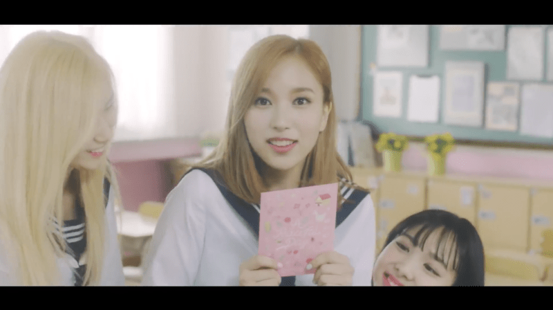


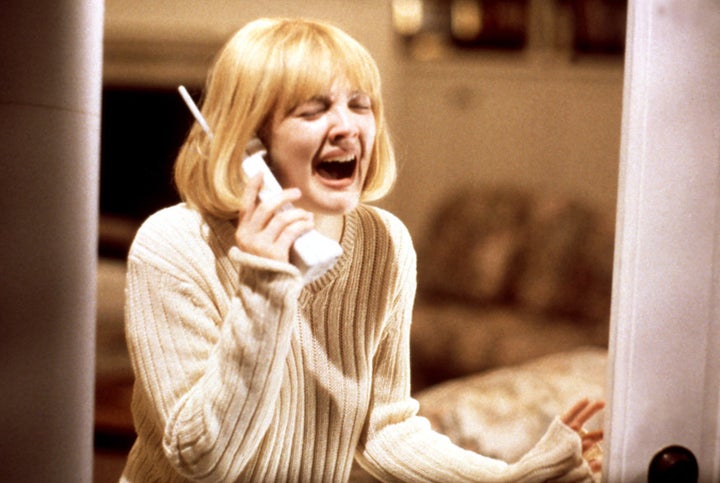